The Art Institute of Chicago is much easier to get to – it’s right there on Michigan Avenue. When I went, there was actually a small crowd waiting to get in. Seems they don’t open to the general public until 11 am (one hour after they let Members in), so there’s time to hang around if, er, when you get there early. Fortunately, it’s just south of Millennium Park and just north of Grant Park, so it’s a nice place to stroll around while the clock ticks.
There was a major exhibit on Cezanne that week; I coughed up the extra bucks to see it. It was truly massive; they had works from his entire career – as well as sketches and watercolors, so you could see how he developed his ideas. A neat display had some “tools of the trade” from his era: an art supply catalog, and a few watercolor paint sets. I forget if any of them actually belonged to Cezanne, but it was neat to see that they were a lot like what you can get today. The biggest difference was back then, they were made of metal instead of today’s plastic.
One thing about the Art Institute that I must point out is that it’s actually a group of connected buildings. This makes getting around a bit problematic. Say you’re looking over the Impressonist galleries, and you decide to check on what was going on in the US at the time. Well, it’s down one floor, along a short hallway, and then up a floor. Can’t go right from one second floor gallery to another. And if you next want to see more recent American works? Down to the main level, along a hallway through another gallery, and up another staircase…. It’s a mess. That’s how the place was built, so we’re stuck with it.
Speaking of more recent American art, they have a room given over to the works of Andy Warhol….
….which allows me an opportunity to get up on a soapbox behind a lectern and give you my thoughts on modern art, and just what is “Art” anyway.
I hope you know that Andrew Warhola (to use his birth name) started out as a commercial illustrator, doing things like creating package designs and advertisements. I know bupkis about how he went and became a “Real Artist”, but it’s pretty clear he got to use the same skills. I like to think that when he did his soup can series and Brillo box, he was telling the Art World that those things were legitimate art, even if they were for purely commercial purposes.
When you take a “reductionist” approach to Art, you’ll start using terms like “Line” and “Color” and “Form”. If you stop and think about it for a bit, don’t soup can labels and steel wool boxes have those things, too? Commercial illustrators use the same basic principles as Artists in their work; shouldn’t they get credit for being an artist?
“But it’s purely for commercial purposes. It’s throwaway stuff, it has no real Value”, some would say. To which I respond with one word: Pottery. The vast majority of pottery and ceramics were (and are) intended to be practical items for everyday use. And they were (and are) mass produced. The Art Institute, in their display of Ming-era Chinese porcelain, had a pair of small bowls. One was blue on white, the other red on white. They had the exact same floral pattern, except the red on white was mirror-reversed. As the informational panel noted, the pair was clearly produced in the same workshop, but with the minor changes so that they could turn out a greater variety of items (or something to that effect) with minimal effort on their part.
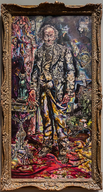
You want another example from the Art Institute? I was happily surprised to see an actual movie prop in one room. It was Ivan Albright’s “Picture of Dorian Gray”, created for the 1945 movie adaptation of Oscar Wilde’s novel. Albright was a Chicago-based artist who got the commission to make a “truly icky” full-length portrait for the movie. Now, just because it was a movie prop, made for purely commercial purposes, does that mean it’s not Art? How about all the other paintings and works made on commission? Do you honestly think every artist creates stuff only when the muse pops in for a visit, and never when someone comes calling with a wad of cash?
Great Art? Your call.
A lot of the problem in my opinion is that the contemporary art world has gotten far too full of itself, and uses terms and phrasing that’s utter bullcrap in order to pass of rubbish as “Great Art”. One example was a work that was nothing but a pile of candies on the floor. And yes, you were encouraged to take some. I forget what nonsense the informational panel had about it.
Another example was outside, in nearby Millennium Park. An “installation” by Christine Tarkowski, the official name is too long to bother with here (a quote from William Herschel, it’s something on the order of 50 to 60 words long). According to the sign, it (supposedly) “questions and critiques (with gentle irony) how we design and build cities, as well as manipulate and re-present natural forms”…. Dude, it’s a trio of huge, rough blocks of concrete, over which (just out of reach) are suspended hollow blobs of colored glass that glint and glisten in the light. I see nothing of your silliness about cities and natural forms; I see bits of color arranged in a whimsical manner that should bring a smile to the face of anyone walking underneath them. Does it HAVE to be serious? Can’t ART be fun and playful?
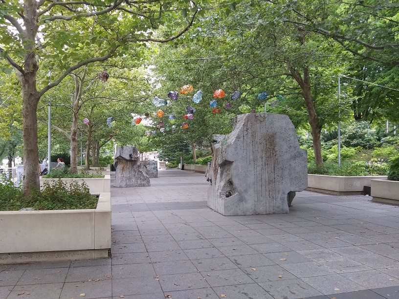
Bet it looks cool in the winter, when the trees are bare and the sun can shine on and through them.
Well, that’s enough of that.
Speaking of fun and playful ART, while you’re at the Art Institute, don’t miss the Thorne Miniature Rooms Gallery…..
A few more museums next time.
