Pretty much every news website has one of those maps of the United States for the presidential election on their main page. You know, the ones that color a state red if they went for the Republican candidate, and blue if they went for the Democrat.
Those maps have so many problems. They don’t give you any idea of how many actual votes – electoral or popular – a state contributes to the total, or the margins of victory in each state. I get it; all the ‘good’ maps that show that extra information are clunky or require special explanations. The basic Red – Blue Map is understandable at a glance. Leave the fancy stuff for after the election is really over.
But in a protracted election like we have now, the maps have been really terrible.
Here are three that I grabbed this morning (Friday, November 6).
USA Today is the worst. You have to squint to see the diagonal lines to indicate the state hasn’t “called” its results yet.

If there aren’t any yellow or black states, why do you need those colors in the key?
The New York Times is a bit better. They have the “uncalled” states with a diagonal gray hashing, with the “percent of ballots counted” over them. That’s fine, but why are Wisconsin and Michigan a darker blue? Oh, that’ because you REALLY NEED TO KNOW that they went Republican in 2016…..
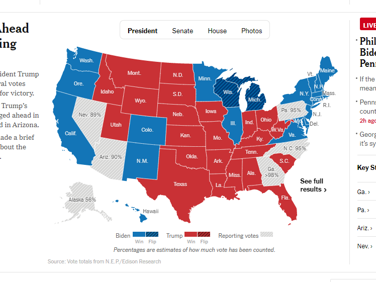
So I guess five states went for a third party?
I like the Washington Post’s map the best. The colors are a but muted to make them easy on the eyes, and the “uncalled” states have diagonal lines in red or blue to indicate which candidate is leading at the moment. The “flipping” of Wisconsin and Michigan are indicated by white text and a little arrow.

Much better.
There’s one thing everyone seems to be doing that really needs to stop. I agree that it is useful to show the vote counts in the “uncalled” states – but do you have to show the percentage of ballots counted?
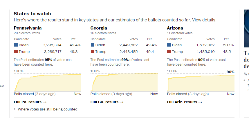
Almost completely useless.
That tells me NOTHING. Okay, I can see that Biden has 3,295,304 votes and Trump has 3,282,717 votes with about 95% of the ballots counted. But what I really need and want to know is how much is Biden’s lead, and about how many ballots are left to count? Yes, it’s nice to know that Joe is in front five seconds in this footrace, but when I don’t know how long the race is, that’s useless! Is it the 800 meter or 10 Km? And how close is he to the finish line?
I would MUCH rather see a table that was something like this:
Biden 3,295,304
Trump 3,282,717
Current margin: 12,587
Estimated ballots remaining: 346,000
Much more useful, isn’t it……

Absolutely
LikeLike