With baseball season beginning next week, it’s going to be a great relief to have something other than politics to talk about in everyday conversation. Now I could use this opportunity to discuss my picks for the Divisional Champions (Nationals, Cubs, Dodgers, Red Sox, Indians, Astros), but I really haven’t been paying attention to how Spring Training has been going. There are a divisions where things should be interesting (AL and NL East, AL West), but it will probably come down to which team stays the healthiest over the season. And of course once the playoffs begin, it’s almost impossible to predict an outcome.
So what else is there to talk about?
Some of you may recall that a long time ago, in a galaxy far away, I posted an essay on how the “win” was actually a relevant stat for starting pitchers.
While my analysis was detailed and insightful, I noted afterwards that I had left a few things out of the argument. First, I did not offer any evidence that my chosen comparison stats of WHIP (Walks plus Hits per Innings Pitched) and ERA+ (an adjusted version of Earned Run Average that takes into account park factors and the league average) were actually valid choices for the analysis. I also went with the number of Wins, rather than Won-Loss Percentage, which I felt would have been a better choice as it did not depend on the number of Games Started – more opportunities for a Win would logically mean more Wins….
So, let’s have another go at it, using the numbers provided by Baseball Reference for the 2016 season.
If I were a real scientist, I’d set this up with the usual sections: Abstract, Introduction, Data, Analysis (or whatever the normal structure is for a scientific paper). But I’m not.
1. Testing the validity of the chosen stats
First, we need to see if there really is a good correlation between WHIP, ERA+, and Won-Loss Percentage (W-L%). Fortunately, there is a way to test this. Our source data set includes those stats for the thirty teams, as well as for individual players. So on the principle that what is good for a player is good for a team (and vice-versa), we can check the correlation of those stats for the teams as a whole:
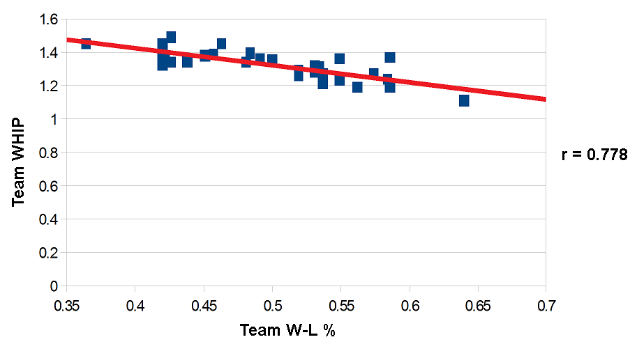
Team WHIP and Team Won-Loss Percentage

Team ERA+ and Team Won-Loss Percentage
Those are pretty good fits, wouldn’t you say? And it’s not just the “eyeball test”; checking the correlation coefficients (the “r” value; the higher it is the better) makes it quite clear that there really is at least some correlation. I feel it’s safe to say that WHIP and ERA+ are good indicators of a team’s success, and therefore an individual pitcher’s success.
2. Choosing a data set
Last time, I chose all pitchers with 20 or more starts. I didn’t want to include spot starters and minor-league call ups; pitchers with just a handful of starts could very well skew the stats and invalidate the analysis. However, I just pulled that number out of the air and gave no justification for it. I could have easily chosen 22 or 17.
Let’s see if there might actually be a more rational cutoff.
Here’s a chart showing the number of pitchers with a given number of starts. Only one pitcher started 35 games, while thirty pitchers had just one start each:

Number of pitchers per Number of starts
Check it out! Not one single pitcher in all of Major League Baseball in 2016 had precisely sixteen starts! Let’s use that as the cutoff. That means we’ll have 142 pitchers in our data set. More than enough for a good analysis.
3. Crunching the numbers
Well, here’s what we get:
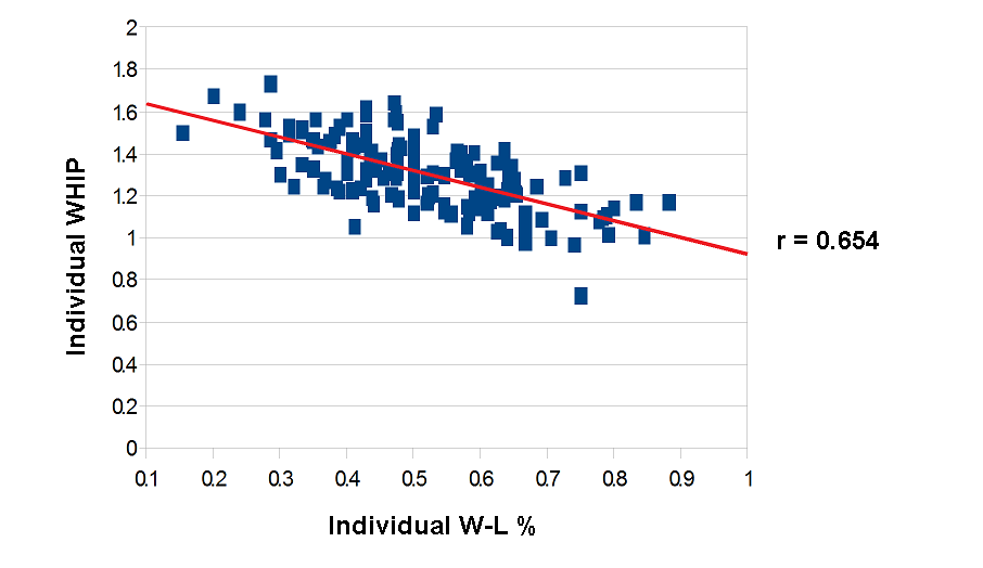
WHIP and Individual Won-Loss Percentage

ERA+ and Individual Won-Loss Percentage
The red lines show the best fit to the data. Again, we’ve got rough ovals along a straight line. By the way, that point on the ERA+ chart that’s way off from the rest? That’s Clayton Kershaw….
The r values for the correlation coefficients are smaller here than they were for the teams. That’s to be expected, not only are there more data points, but there’s a greater variation among individuals than there is among groups. But even so, that still is a strong correlation. I leave it to the statisticians (the mathematicians, and not the people who collect the raw information) to tell just how strong a correlation this is.
4. Conclusion
With the expanded and revised data set, it is still clear that a for full-time starters, the Win (or at least Won-Loss Percentage) is still a good, easy to understand “stat” that reflects their real talent and ability. So as the season progresses, when people tell you that the “Win” is outdated, tell them that while it might be the case for relief pitchers, it still works for starters. Simply put, better pitchers win more games. So a pitcher with more wins…..

Pingback: Just Checking… | Pure Blather
Pingback: deGrom, Nola, Scherzer | Pure Blather
Pingback: 2023 in Review | Pure Blather