I’m pretty good at reading maps. I’ve never needed a GPS (well, except for that one time I took a rental car to the Baseball Hall of Fame, and even then I missed a turn and got lost). These days, when I’m traveling, I like to go online and print out a map of my route and the local area where I will be.
But often it’s not easy to do. It’s not that the online maps use color shadings that are worse than useless on a printout. It’s a matter of orientation and scale.
Recently, I took a day trip to Atlantic City. The optimal route from New York City to there is via the Garden State Parkway. However, I know that in the summer, the GSP to AC can be clogged with beach traffic, so I wanted to check out possible alternate routes. US 9 pretty much parallels the GSP, with a number of interchanges along their routes.
When I check it out on Google Maps, here’s what I get:
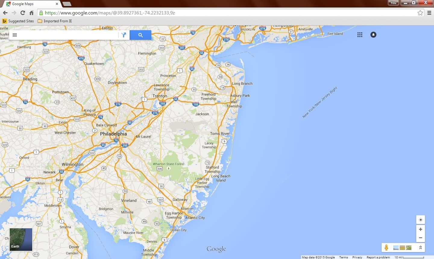
What’s wrong with this picture?
Well, look at all the extra crap that I don’t need. Heck, half the screen is the Atlantic Ocean! The part I’m interested in is only the central strip of the display. And I’m not getting enough detail at this scale for it to be useful.
Let’s zoom in.
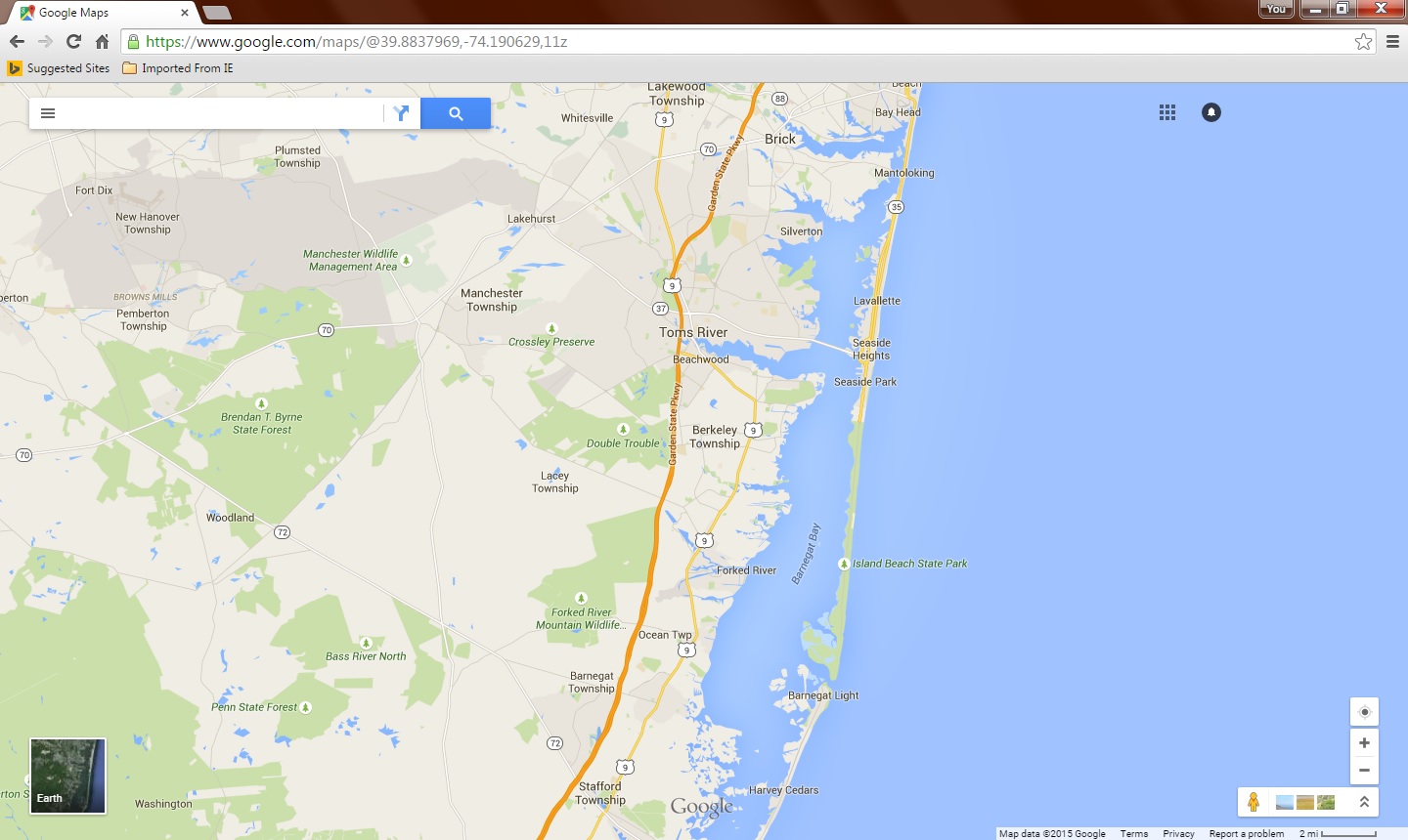
There’s some nice detail, but I’m only getting about one fourth of the route! If I want a printout of the entire route, I’m going to have to either print out three or four sheets, or somehow digitally manipulate three or four images into one single map. What a waste of time and effort.
It shouldn’t take much to fix this. The key issue here is that the route I’m interested in runs vertically, north – south. The rectangle of my computer screen runs horizontally. If one could simply rotate the displayed map ninety degrees at the click of a button….
The entire route, with sufficient detail. And all it needs is a basic rotation operator applied to the map data set. Now I could go into the display properties for my monitor and find the option to rotate my screen ninety degrees, but then I’d have to physically turn my monitor on its side if I don’t want to ruin my neck or go insane trying to adjust to the changes in how my mouse pointer behaves.
It shouldn’t be too complicated; even the simplest of graphic display programs let you rotate an image. As far as the landmarks are concerned, if you pay attention as you zoom in to the higher detail levels, you’ll note that they seem to exist in a separate “layer” over the map image. So you don’t rotate those – just let them “float” over the map as they already do, and they should still be readable.
It’s not just Google; Mapquest and Yahoo! Maps are guilty of this as well. I’m picking on Google because they are the most popular. And when you consider all the other neat things you can do with Google Maps, the fact that Google doesn’t allow something so simple and fundamental is mind boggling. How hard can it be? You can add any specific user-defined location to the map, show subway routes, street views, and photos of points of interest that appear on the map, and even give live traffic conditions. Why not the option of a ninety degree rotation?
