You probably missed it, but Utah has a new state flag, replacing its old cluttered and frankly ugly one:

Utah’s old flag
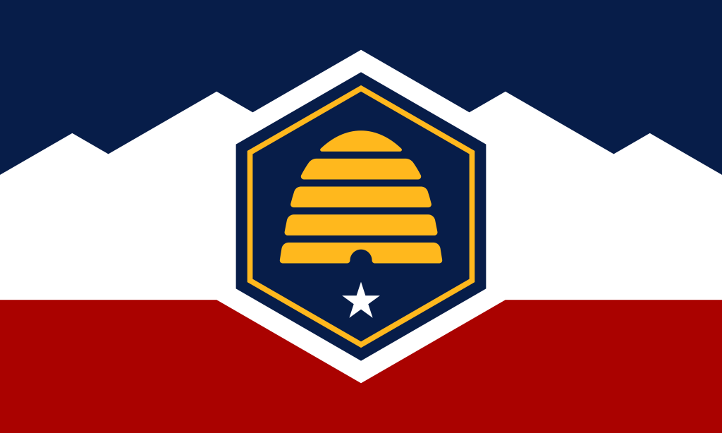
Utah: NEW AND IMPROVED!
A good number of other states are considering redesigns as well, and not just to remove traces of the Confederacy or other things of “questionable” merit. It’s that most state flags are crap. Vexillalogists Vexillololiphiles Flag buffs describe most of them as “S.O.B.s”, meaning that they are nothing more than the state seal on a blue field. Which does very little towards making a flag distinctive, which is one of the most important things you want in a flag.
Anyone with a minimal design sense can slap together a decent flag, as long as you follow a few basic rules: Keep it simple, have no words or numbers, make it distinctive, and give it some connection to what it represents.
Since I have at least a minimal design sense, there’s nothing to stop me from having a go at the flags of the two states that I have called home. And as it happens, they’re both SOB’s that cry out for a redesign.
New York’s is a IN YOUR FACE SOB.
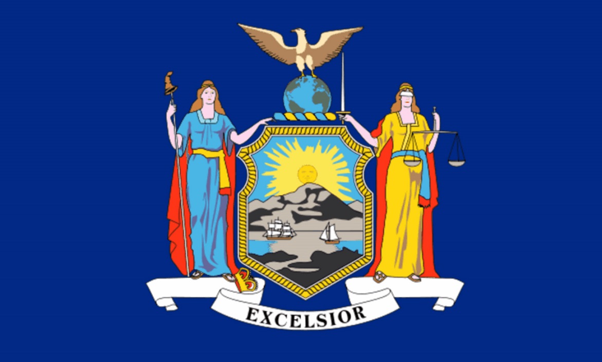
You got a problem with that?
Let’s trash it and start over.
The flag of New York City is a blue-white-orange tricolor (with the city seal stuck in the middle). The color combo is good; so is the tricolor. To make it different, let’s go with a horizontal version. That’s still rather common in flags, so what if we played with the white band? In heraldic terms, that’s a “fess dancetty” – the line “dances” across the field. Bet you don’t see that often! Simple and distinctive, right? If you want to connect it to the state, the orange represents the Dutch who were the first settlers in the region, and the two “peaks” can represent the Catskills and the Adirondacks, the two main mountainous regions of the state.

New New York!
If it weren’t just another SOB, Connecticut’s could be OK. The state seal is arguably the simplest one around – “Argent, three grape arbors, proper” in heraldic speak. The banner with the state motto has to go, though.

Bad enough that there are words, but to have them in Latin?
We can keep the seal (as long as we simplify it a bit), but let’s do something with the background. How about green? It’s an underused color in state flags. To make it a bit more interesting, stick blue bars at the top and bottom, but to help them stand out, separate them from the green with white lines:

Not bad, I must say.
If you must, the green represents the forests, parks, and nature in general in the state. The blue at the top is the sky (naturally); the blue at the bottom is Long Island Sound.
It took me about an hour to slap BOTH of these together. What do you think? What should your state flag be?
