So Major League Baseball is starting Version 2.0 of the “City Connect” uniforms. Some of the new versions are clear improvements (e.g. Dodgers (though it wasn’t hard to come up with something better for them)); others are along the lines of “What were you thinking? Your first ones were great!” (e.g. Boston) Cynics can see them as just another way to suck money away from fans; others can see them as cool and fun ways to try something different on occasion.
I, of course, have my own Thoughts on the Matter.
So far, two teams haven’t had any “City Connect” uniforms.
The Athletics, for obvious reasons, don’t have a “city” to “connect” with at the moment. So we are free to imagine what we’d like to see for them. I’m thinking of stealing the look from that other Oakland team with a crappy owner, who also moved the team around willy-nilly. Go with the black, silver, and white of the Oakland Raiders, complete with large numbers on the front – and no team name. For extra bonus points, use the silver / light gray and white version – that was used by the team in 1994, the year before they moved BACK to Oakland from Los Angeles.

The “diamond” patch is to note the 75th anniversary of the NFL.
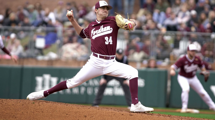
The New York Yankees are the other team that has yet to get in on the action. One could say that their standard uniforms are classic and there’s no need for any change (even for a special occasion), or you could say that the team is pompous and arrogant and thinks they’re above all that.
That leaves us free to come up with our own versions of “City Connect” uniforms for them!
Most people don’t realize that New York City qualifies as a “college town”. Columbia, NYU, St. John’s, and Fordham are the best known of the city’s many institutions of Higher Learning. Heck, Fordham is right down the road a mile or so from Yankee Stadium. Maybe the Yankees could borrow the maroon and white color scheme of the Fordham sports teams, and use a “Varsity”-style font?
GO RAMS!
Maroon is really underused in MLB.
Or perhaps they could go with something else that “connects” the “city” – the Metropolitan Transit Authority. Copy the look of the signage on the subways. Black shirts and white pants, using the exact same font. Green piping on the pants, and the “NY” logo in white on a green circle. The green is for the #4 Lexington Avenue subway line – they could also go with orange for the B and D lines, but orange is too common in MLB uniforms.

I was kind of hoping the New York Mets would use the “subway” look for their City Connects. Perhaps in their Version 2.0, if they have one. Another possibility would really connect to their neighborhood. Flushing is home to one of the largest Korean populations outside of Korea itself. What if they kept the look of one of their regular uniforms, but instead had “New York Mets” in Hangul, the Korean script, on the front?
뉴욕 메츠
(Online translators say that’s “New York Mets”.)
Speaking of actually “connecting” with your city, here’s an idea that a team SHOULD use:
Ask area high schools to submit designs (one per school). Leave it up to the individual schools how they choose which ones they’ll submit from all the designs their students come up with. Have a committee that includes at least one player from the team and one of the team’s local broadcasters narrow the submissions down to four or five (ones that would actually work). Have the city’s main daily newspaper conduct a poll to see which one people like the most. Could be a lot of fun.
