As the presidential campaign heads into its final weeks, you might start seeing maps of the US with the states colored in according to how they are expected to vote in the Electoral College. The more relevant ones are those that come out after the election, showing the actual results. We all know that the EC is a clunky way to choose a president, but we’re stuck with it until someone gets the political will and energy to amend the Constitution to change it.
But that doesn’t mean we can’t do something about those maps – which surely drive data scientists bonkers with their awfulness.
NOTE: Examples use 2020 election results. All but the last map were ‘borrowed’ from World Mapper; the last map came from XKCD.
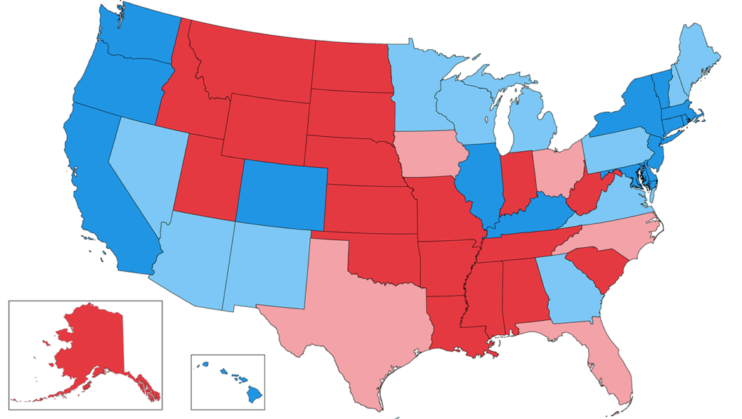
There are two problems. First, the usual presentation gives undue weight to all those big and sparsely populated states in the West. As a lot of people complain, “Land doesn’t vote”. Second, while the EC assigns its votes on a “winner takes all” method (except for Maine and Nebraska – good for them!), the usual coloring does nothing to suggest how close the voting was in each state – which would go a long way to showing how tight the election really was.
One easy change would be to shade the states according to the margin of victory:
Better, but there’s still room for improvement.
First of all, the area of a state has no relationship to its electoral votes. To take an extreme case, Delaware and Wyoming both have three electoral votes. But Wyoming is nearly fifty times the size of Delaware. What if you tweaked the map so that the size of a state was proportional to its electoral votes?
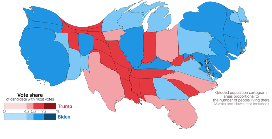
Now we’re getting somewhere.
So far, the maps assume an even population density within a state. What if we gave our map a “finer grain” and color our regions on a per-county basis? And because I can’t find any good intermediate maps, let the size of each region be proportional to the population of the county? And shade each one according to the margin of victory?
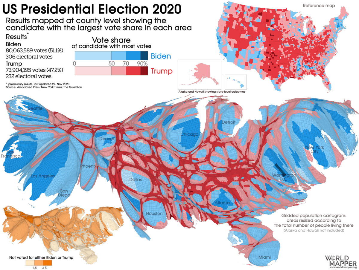
Nice of them to include an inset showing the non-voters (those jerks)
GAH! Sure, we’re getting the kind of voting detail we need, but that’s an UGLY map.
One last try. What if we kept the map of the US that everyone knows, but just put dots on it to indicate where the votes came from? You’d need to decide how fine a level of detail you want….
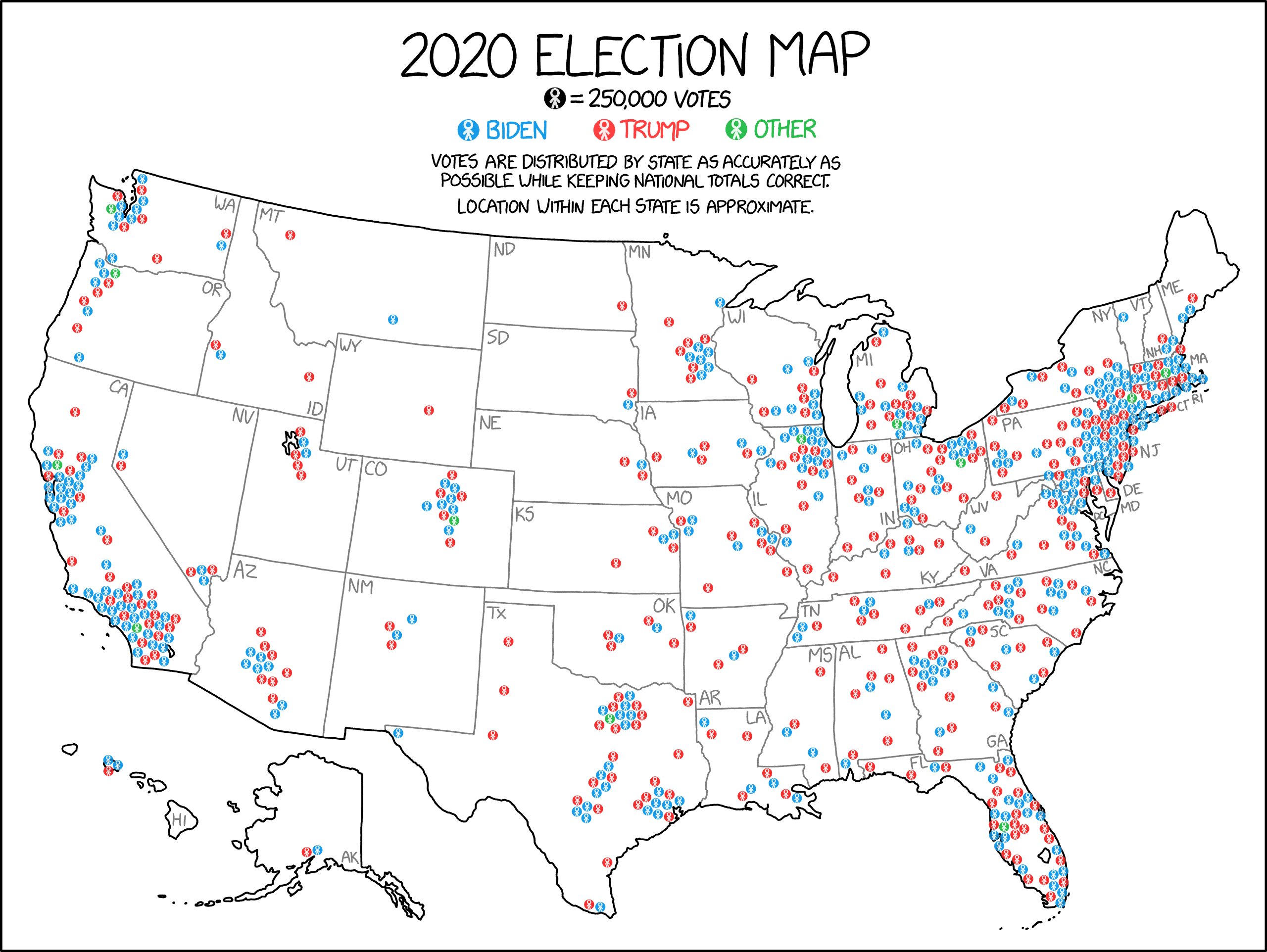
Lots of blue in “red” states – and red in “blue” states….
OK, looks good (I suppose). But still not easy to read, especially when the election is really close.
I guess you’ll just have to pick the map that suits your needs the best (i.e. best supports the point you’re trying to make). Because we all know data can be manipulated without needing to lie……
